6441Views 0Comments
Hulu’s biggest redesign in years offers a more standardized experience, improved navigation and discovery
H
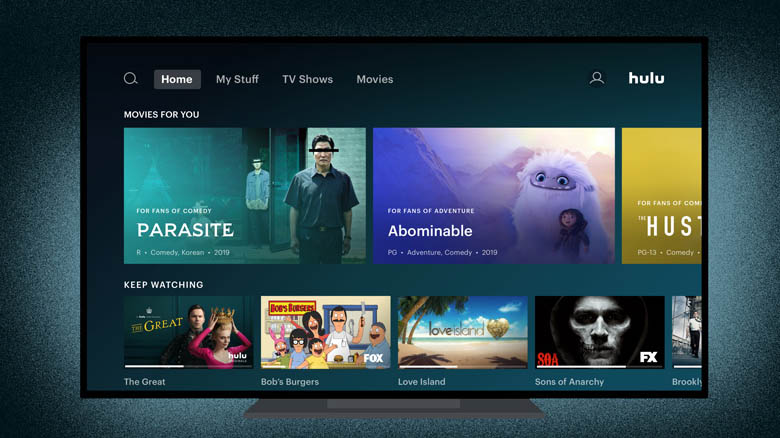
ulu today will begin rolling out its largest redesign in years. The company is moving toward a more standardized, even Netflix-like user interface, featuring collections laid out vertically within the Home screen, while tiles within the collections are laid out horizontally, in scrollable rows. However, the end result is not a Netflix clone, as Hulu continues to make use of its editorial imagery to highlight select titles and now uses a variety of tile sizes to communicate information about the content it recommends.
Hulu will also simplify its top-level navigation, moving categories like “TV,” “Movies” and “Sports” to the top of the screen, to make it easier for users to drill down into the type of content they watch.
These changes follow Hulu’s first big redesign in 2017 which arrived alongside the launch of Hulu’s Live TV experience. Though that update did help to differentiate Hulu from other streaming services, it also overcomplicated the user interface. Hulu’s customer feedback forums were filled with complaints about the interface being too difficult to navigate and the confusing layout.